

The 1200 x 627 pixel ratio is the best image size for linkedin post engagement, as it aligns perfectly with the platform’s default feed display. You should aim for this landscape orientation to ensure your visuals don’t get cropped or distorted when they appear on mobile devices or desktop browsers. Following these specific dimensions prevents the loss of important text or design elements in your shared content.
Understanding LinkedIn image size requirements
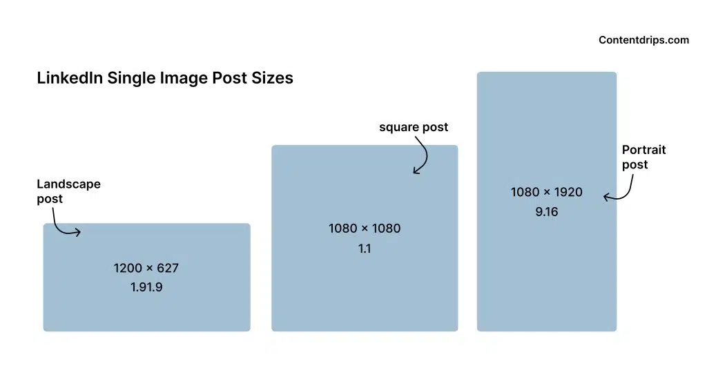
Visuals that match the platform’s native aspect ratio look more professional and trustworthy to your connections. When you upload a file with the correct dimensions, the system doesn’t need to shrink or stretch your image to fit the container. This maintains the clarity of your text and the sharpness of your graphics, which is vital for building a strong personal brand.
The most common mistake is uploading low-resolution images that appear pixelated on high-definition screens. People often pull images directly from other social platforms without checking the pixel count first. This costs you credibility because it makes your content look like an afterthought. Always verify your file dimensions before you hit post to ensure your work looks sharp on every device.
If you’re unsure of the fit, use the 1.91:1 ratio for horizontal posts or a 4:5 ratio for vertical mobile feeds. If your image text appears blurry on a desktop monitor, your resolution is likely below 1080 pixels wide. Use a higher density file to prevent the platform’s compression algorithm from degrading your visual quality.
Setting Up Your Graphics
- Open your design software and create a new canvas set to exactly 1200 pixels wide by 627 pixels tall.
- Place your most important visual information or text in the center of the canvas to avoid clipping.
- Save your file as a PNG or JPG format, ensuring the total file size remains under 8 megabytes.
- Check the color profile of your image to ensure it’s set to sRGB, which is the standard for web viewing.
- Upload the final file directly to the post creator window to avoid the compression that happens when sharing external links.
Tip: If your design includes a lot of small text, use a PNG format to prevent the “blurring” effect that often happens with high-contrast JPG compression.
Tip: Avoid putting logos or text right at the very edge of your canvas, as different screen sizes might still cut off a few pixels.
If you’re using professional design tools, you can find the LinkedIn image specifications published in their help center to confirm any platform updates.
How long it takes to create the best image size for LinkedIn Post

Creating an optimized image usually takes between five and fifteen minutes depending on your design experience.
| Situation | How long | What changes it | What to watch for |
|---|---|---|---|
| Simple template | 5 minutes | Using pre-made layouts | Alignment issues |
| Custom illustration | 15+ minutes | Drawing complex assets | Resolution quality |
| Batch editing | 2 minutes/image | Using bulk export tools | Text readability |
| Resizing old art | 10 minutes | Adjusting canvas ratio | Image stretching |
If your process consistently exceeds fifteen minutes, you’re likely suffering from “pixel-perfect paralysis.” This occurs when you spend too much time adjusting elements that are invisible to the end user.
The decision rule is simple: if you’re tweaking a single element for more than sixty seconds, stop. If the change doesn’t improve the visual hierarchy or brand clarity, revert to your previous version.
A common mistake is failing to set your canvas dimensions before beginning. This forces you to manually re-center every asset later, which can double your production time. If you find yourself resizing assets more than twice, discard the current file and start fresh on a correctly sized template.
How to tell when it’s done
You can tell your image is ready when it looks crisp on both a mobile phone screen and a large computer monitor. A professional post should have no blurry edges, and all text must be readable at a glance without zooming in.
The ultimate test is to preview your post in the “draft” mode on the actual platform before you publish it. If the text is readable and the image fills the space without awkward white bars on the sides, it’s ready to go.
Most creators fail by ignoring the “safe zone” for mobile crops. If your focal point sits within the center 80 percent of the frame, it will survive the automatic cropping that occurs on social feeds. If your subject touches the edge, it will likely be cut off.
Mistakes that ruin it
- Ignoring safe zones: Placing text too close to the edge causes it to be cut off on mobile devices, which makes your message impossible to read. Always keep your main content in the center area to ensure it stays visible on all screens.
- Using incorrect aspect ratios: Uploading a square or vertical image forces the platform to crop your content or add ugly borders. Use a standard landscape ratio to ensure your entire image is seen exactly as you intended.
- Over-compressing the file: If you make the file size too small, the image will look “noisy” and pixelated, which lowers the quality of your post. Aim for the highest possible resolution that stays under the 8 megabyte limit to keep your visuals sharp and clean.
Frequently asked questions: Best Image Size for LinkedIn Post

Can I use a vertical image for my post?
Yes, you can use a vertical image, but it will be cropped to fit the standard feed window. This often results in the top or bottom of your image being cut off, which can ruin your design. It’s much better to resize your image to the standard landscape format before you upload it to ensure your full message remains visible to your audience.
Why is my image blurry after uploading?
Your image is likely blurry because it was compressed too much during the export process or the resolution was too low. The platform automatically compresses files that are too large or have incorrect pixel dimensions. To fix this, export your file as a high-quality PNG and ensure the dimensions are set to the recommended 1200 x 627 pixels before you begin the upload.
How long should the text on the image be?
Keep the text on your image very short, ideally under 20 words, so it remains readable on small smartphone screens. If you have a long message, put the details in the post body instead of inside the graphic. People scrolling through their feed will rarely stop to read blocks of tiny text, so keep your visual copy punchy and clear for the best results.
Is it safe to use stock photos?
Yes, it’s safe to use stock photos as long as you have the correct commercial license for them. If you don’t have permission, you risk copyright issues that can lead to your account being flagged or your content being removed. Always ensure you have the rights to any image you post to maintain a professional reputation and avoid legal trouble with the original content creators.
What happens if my file is over 8 MB?
If your file is over 8 megabytes, the upload will likely fail or the platform will force a heavy compression that ruins the quality. You must reduce the file size by lowering the resolution or changing the file format to a more efficient one like JPG. Never try to bypass this limit, as the platform’s automated systems will simply degrade the visual quality during the processing step.
Final Thoughts
Taking a moment to double-check your layouts before you hit publish will make a world of difference for your professional brand. When your images look crisp and intentional, people are much more likely to stop scrolling and engage. You’ll be surprised at how much more professional your feed looks today.
Related guides